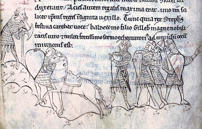
Drawing of the Battle of Lincoln from Henry of Huntingdon's Historia Anglorum, British Library, Arundel 48. Viewed 33 million times on the front page of Italian Wikipedia in Feb 2017.
Someone asked me recently if there's any evidence that people really want access to digitised collections, so I popped onto twitter and asked, 'Does anyone have a good example of a digitised image on Wikimedia or similar that reached a huge audience compared to the GLAM's own site?'. Here are the responses I received:
Jason Evans, (@WIKI_NLW), Wikimedian at the National Library of Wales said, 'We shared around 15,000 images from @NLWales about 2 years ago and they have been viewed over 300 million times on Wiki', and 'This image by Magnum Photographer Philip Jones Griffiths is our most viewed with around half a mil views each month [link to stats on BaGLAMa]'.
Pat Hadley (@PatHadley) said 'Coins from @YorkshireMuseum get loads of traffic [link to stats on BaGLAMa] thanks to @YMT_Coins work long after my residency!'. Andrew Woods @YMT_Coins expanded that the project wasn't just about getting big numbers: 'My aims were more associated w proof of concept. Can we do this? How long does it take? Possible with volunteers with no previous exp? Etc'. It's fantastic to see this sort of experiment with specialist collections.
Helge David (@helge_david) shared a link to a YouTube video of The Roentgens' Berlin Secretary Cabinet, saying '14.1 million views of an 18th century cabinet suggests the right object can catch people's imagination when some care is taken to make it intellectually accessible and freely available online.' The video proves that perfectly, I think.
Sara Devine (@SaraDevine) replied to say 'Yes! We have several @brooklynmuseum examples from past project[s]', linking to "Africanizing" Wikipedia, one of Brooklyn Museum's experiments with sharing images and improving content on Wikipedia.
Illtud Daniel (@illtud) simply linked to a tweet saying that a National Library of Wales image was used on Europeana's 404 page, asking 'Is this cheating?'.
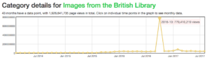
Discussing images from the British Library, my colleague Ben O'Steen (@benosteen) noted that a manuscript image of Stephen of England had 735,324,085 views when it was on the front page of the English-language Wikipedia in October 2016.
As of May 2017, 'On average we get 19 million page views a month on articles that feature material from our archive. This exposure is generated by the 9,000 articles that reuse our material (spread over more than 100 languages versions of Wikipedia).
Since we've been available for reuse on Wikimedia Commons, in total, pages that reuse our content have generated 668 million page views.
To date we have donated about 10,000 digital objects to Wikimedia Commons, of which 35% are actually being reused in one article or more.'
As you can tell by the number of links to stats on BaGLAMa, this tool is key for organisations who want to understand where their images are being viewed across Wikimedia. The huge spike in the image shows the month mentioned by Ben when Stephen of England hit the front page of Wikipedia. (A few years ago I posted tips on Who loves your stuff? How to collect links to your site.)
Thanks to the example shared in response to a single tweet, it seems clear that even if people don't say to themselves, 'what I really want is an image from a museum, archive or library', when they want the answer to a question, content from cultural institutions helps make that answer a good one. Views on images on an institution's own site might be relatively low, but making those images reusable by Wikimedia and other sites like Retronaut clearly has an impact. It's not just that someone has done the work to put items in context and make them intellectually (or emotionally) accessible, it's also that they're placed on sites and platforms that people are already used to visiting. Access to digitised collections provides a useful public service, provoking curiosity and wonder, and teaching us about the past.
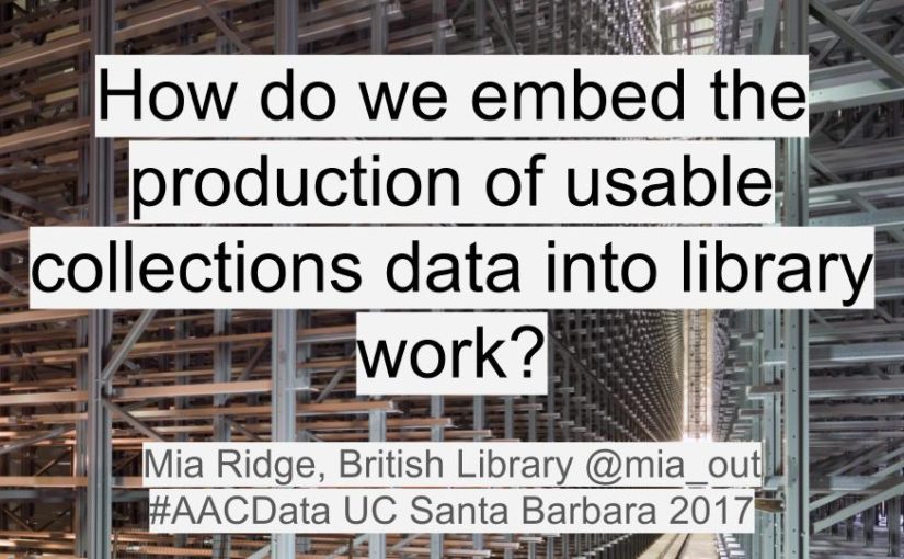
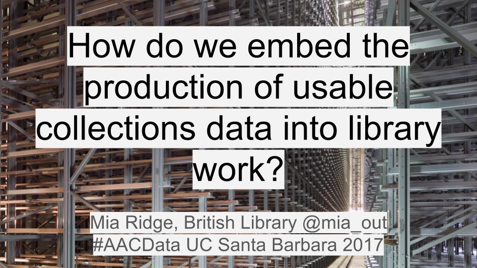
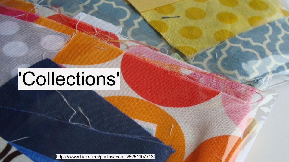
These notes were prepared for a panel discussion at the 'Always Already Computational: Collections as Data' (#AACdata) workshop, held in Santa Barbara in March 2017. While my latest thinking on the gap between the scale of collections and the quality of data about them is informed by my role in the Digital Scholarship team at the British Library, I've also drawn on work with catalogues and open cultural data at Melbourne Museum, the Museum of London, the Science Museum and various fellowships. My thanks to the organisers and the Institute of Museum and Library Services for the opportunity to attend. My position paper was called 'From libraries as patchwork to datasets as assemblages?' but in hindsight, piles and patchwork of material seemed a better analogy.
The invitation to this panel asked us to share our experience and perspective on various themes. I'm focusing on the challenges in making collections available as data, based on years of working towards open cultural data from within various museums and libraries. I've condensed my thoughts about the challenges down into the question on the slide: How do we embed the production of usable collections data into library work?
It has to be usable, because if it's not then why are we doing it? It has to be embedded because data in one-off projects gets isolated and stale. 'Production' is there because infrastructure and workflow is unsexy but necessary for access to the material that makes digital scholarship possible.
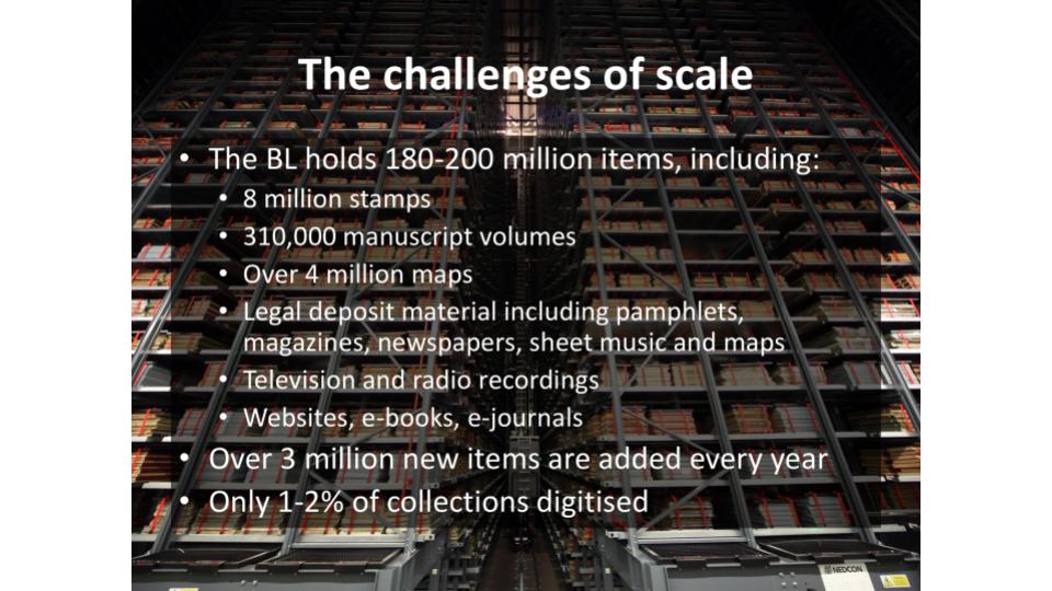
One of the biggest issues the British Library (BL) faces is scale. The BL's collections are vast – maybe 200 million items – and extremely varied. My experience shows that publishing datasets (or sharing them with aggregators) exposes the shortcomings of past cataloguing practices, making the size of the backlog all too apparent.
Good collections data (or metadata, depending on how you look at it) is necessary to avoid the overwhelmed, jumble sale feeling of using a huge aggregator like Europeana, Trove, or the DPLA, where you feel there's treasure within reach, if only you could find it. Publishing collections online often increases the number of enquiries about them – how can institution deal with enquiries at scale when they already have a cataloguing backlog? Computational methods like entity identification and extraction could complement the 'gold standard' cataloguing already in progress. If they're made widely available, these other methods might help bridge the resourcing gaps that mean it's easier to find items from richer institutions and countries than from poorer ones.
You probably already all know this, but it's worth remembering: our collections aren't even (yet) a patchwork of materials. The collections we hold, and the subset we can digitise and make available for re-use are only a tiny proportion of what once existed. Each piece was once part of something bigger, and what we have now has been shaped by cumulative practical and intellectual decisions made over decades or centuries. Digitisation projects range from tiny specialist databases to huge commercial genealogy deals, while some areas of the collections don't yet have digital catalogue records. Some items can't be digitised because they're too big, small or fragile for scanning or photography; others can't be shared because of copyright, data protection or cultural sensitivities. We need to be careful in how we label datasets so that the absences are evident.
(Here, 'data' may include various types of metadata, automatically generated OCR or handwritten text recognition transcripts, digital images, audio or video files, crowdsourced enhancements or any combination or these and more)
In addition to the incompleteness or fuzziness of catalogue data, when collections appear as data, it's often as great big lumps of things. It's hard for normal scholars to process (or just unzip) 4gb of data.
Currently, datasets are often created outside normal processes, and over time they become 'stale' as they're not updated when source collections records change. And when they manage to unzip them, the records rely on internal references – name authorities for people, places, etc – that can only be seen as strings rather than things until extra work is undertaken.
The BL's metadata team have experimented with 'researcher format' CSV exports around specific themes (eg an exhibition), and CSV is undoubtedly the most accessible format – but what we really need is the ability for people to create their own queries across catalogues, and create their own datasets from the results. (And by queries I don't mean SPARQL but rather faceted browsing or structured search forms).
Collections are huge (and resources relatively small) so we need to supplement manual cataloguing with other methods. Sometimes the work of crafting links from catalogues to external authorities and identifiers will be a machine job, with pieces sewn together at industrial speed via entity recognition tools that can pull categories out or text and images. Sometimes it's operated by a technologist who runs records through OpenRefine to find links to name authorities or Wikidata records. Sometimes it's a labour of scholarly love, with links painstakingly researched, hand-tacked together to make sure they fit before they're finally recorded in a bespoke database.
This linking work often happens outside the institution, so how can we ingest and re-use it appropriately? And if we're to take advantage of computational methods and external enhancements, then we need ways to signal which categories were applied by catalogues, which by software, by external groups, etc.
The workflow and interface adjustments required would be significant, but even more challenging would be the internal conversations and changes required before a consensus on the best way to combine the work of cataloguers and computers could emerge.
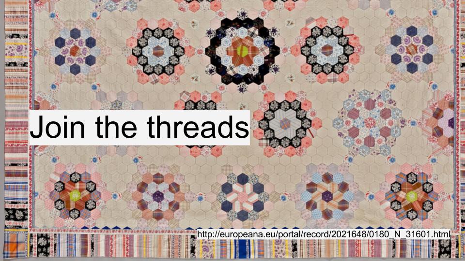
The trick is to move from a collection of pieces to pieces of a collection. Every collection item was created in and about places, and produced by and about people. They have creative, cultural, scientific and intellectual properties. There's a web of connections from each item that should be represented when they appear in datasets. These connections help make datasets more usable, turning strings of text into references to things and concepts to aid discoverability and the application of computational methods by scholars. This enables structured search across datasets – potentially linking an oral history interview with a scientist in the BL sound archive, their scientific publications in journals, annotated transcriptions of their field notebooks from a crowdsourcing project, and published biography in the legal deposit library.
A lot of this work has been done as authority files like AAT, ULAN etc are applied in cataloguing, so our attention should turn to turning local references into URIs and making the most of that investment.
Applying identifiers is hard – it takes expert care to disambiguate personal names, places, concepts, even with all the hinting that context-aware systems might be able to provide as machine learning etc techniques get better. Catalogues can't easily record possible attributions, and there's understandable reluctance to publish an imperfect record, so progress on the backlog is slow. If we're not to be held back by the need for records to be perfectly complete before they're published, then we need to design systems capable of capturing the ambiguity, fuzziness and inherent messiness of historical collections and allowing qualified descriptors for possible links to people, places etc. Then we need to explain the difference to users, so that they don't overly rely on our descriptions, making assumptions about the presence or absence of information when it's not appropriate.
A lot of what we need relies on more responsive infrastructure for workflows and cataloguing systems. For example, the BL's systems are designed around the 'deliverable unit' – the printed or bound volume, the archive box – because for centuries the reading room was where you accessed items. We now need infrastructure that makes items addressable at the manuscript, page and image level in order to make the most of the annotations and links created to shared identifiers.
(I'd love to see absorbent workflows, soaking up any related data or digital surrogates that pass through an organisation, no matter which system they reside in or originate from. We aren't yet making the most of OCRd text, let alone enhanced data from other processes, to aid discoverability or produce datasets from collections.)
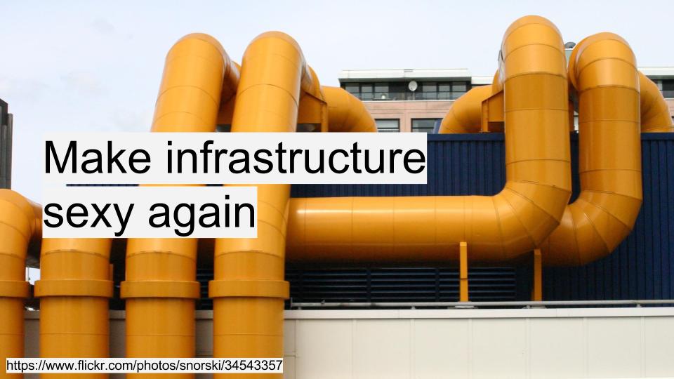
Image credit: https://www.flickr.com/photos/snorski/34543357 My final thought – we can start small and iterate, which is just as well, because we need to work on understanding what users of collections data need and how they want to use them. We're making a start and there's a lot of thoughtful work behind the scenes, but maybe a bit more investment is needed from research libraries to become as comfortable with data users as they are with the readers who pass through their physical doors.
I've developed this exercise on computational data generation and entity extraction for various information/data visualisation workshops I've been teaching lately. These exercises help demonstrate the biases embedded in machine learning and 'AI' tools. As these methods have become more accessible, my dataviz workshops have included more discussion of computational methods for generating data to be visualised. There are two versions of the exercise – the first works with images, the second with text.
In teaching I've found that services that describe images were more accessible and generated richer discussion in class than text-based sites, but it's handy to have the option for people who work with text. If you try something like this in your classes I'd love to hear from you.
It's also a chance to talk about the uses of these technologies in categorising and labelling our posts on social media. We can tell people that their social media posts are analysed for personality traits and mentions of brands, but seeing it in action is much more powerful.
Image exercise: trying computational data generation and entity extraction
Time: c. 5 – 10 minutes plus discussion.
Goal: explore methods for extracting information from text or an image and reflect on what the results tell you about the algorithms
1. Find a sample image
Find an image (e.g. from a news site or digitised text) you can download and drag into the window. It may be most convenient to save a copy to your desktop. Many sites let you load images from a URL, so right- or control-clicking to copy an image location for pasting into the site can be useful.
2. Work in your browser
It's probably easiest to open each of these links in a new browser window. It's best to use Firefox or Chrome, if you can. Safari and Internet Explorer may behave slightly differently on some sites. You should not need to register to use these sites – please read the tips below or ask for help if you get stuck.
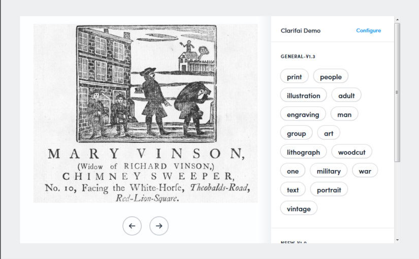
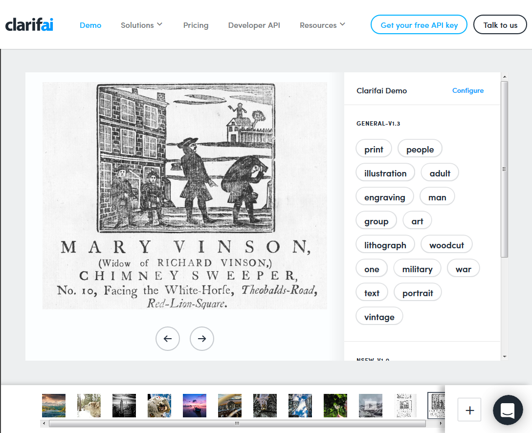
Clarifai https://www.clarifai.com/demo – you can drag and drop, open the file explorer to find an image, or load one from a URL via the large '+' in the bottom right-hand corner. You can adjust settings via the 'Configure' tab.
Google Cloud Vision API https://cloud.google.com/vision/ – don't sign up, scroll down to the 'Try the API' box. Drag and drop your image on the box or click the box to open the file finder. You may need to go through the 'I am not a robot' process.
IBM Watson Visual Recognition https://visual-recognition-demo.mybluemix.net/ – scroll to 'Try the service'. Drag an image onto the grey box or click in the grey box to open the file finder. You can also load an image directly from a URL. (You can no longer try this without signing up so it doesn't work for a quick exercise).
Make notes, or discuss with your neighbour. Be prepared to report back to the group.
What attributes does each tool report on?
Which attributes, if any, were unique to a service?
Based on this, what do companies like Clarifai, Google, IBM and Microsoft seem to think is important to them (or to their users)? (e.g. what does 'safe for work' really mean?)
Who are their users – the public or platform administrators?
How many of possible entities (concepts, people, places, events, references to time or dates, etc) did it pick up?
Is any of the information presented useful?
Did it label anything incorrectly?
What options for exporting or saving the results did the demo offer? What about the underlying service or software?
For tools with configuration options – what could you configure? What difference did changing classifiers or other parameters make?
If you tried it with a few images, did it do better with some than others? Why might that be?
Text exercise: trying computational data generation and entity extraction
Time: c. 5 minutes plus discussion
Goal: explore the impact of source data and algorithms on input text
1.Grab some text
You will need some text for this exercise. The more 'entities' – people, places, dates, concepts – discussed, the better. If you have some text you're working on handy, you can use that. If you're stuck for inspiration, pick a front page story from an online news site. Keep the page open so you can copy a section of text to paste into the websites.
2.Compare text entity labelling websites
Open four or more browser windows or tabs. Open the links below in separate tabs or windows so you can easily compare the results.
How many possible entities (concepts, people, places, events, references to time or dates, etc) did each tool pick up? Is any of the other information presented useful?
Did it label anything incorrectly?
What if you change classifiers or other parameters?
Does it do better with different source material?
What differences did you find between the two tools? What do you think caused those differences?
How much can you find out about the tools and the algorithms they use to create labels?
Where does the data underlying the process come from?
Spoiler alert!
.@mia_out: "According to image recognition software, the world can be divided into safe for work & not safe for work" #beyondtheblackbox
In September I was invited to give a keynote at the Museum Theme Days 2016 in Helsinki. I spoke on 'Reaching out: museums, crowdsourcing and participatory heritage. In lieu of my notes or slides, the video is below. (Great image, thanks YouTube!)
Two YouGov posts on American and British people's knowledge of their recent family history provide some useful figures on how many people in each region have researched family history.
iNaturalist Bioblitz's are also more evidence for the value of time-limited challenges, or as they describe them, 'a communal citizen-science effort to record as many species within a designated location and time period as possible'.
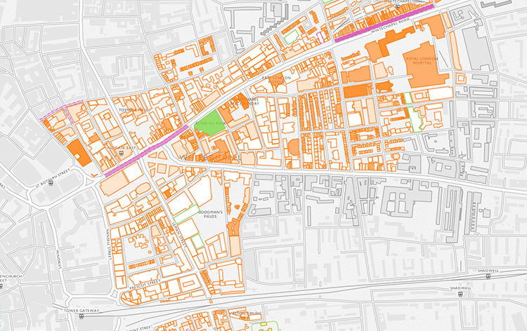
Survey of London and CASA launched the Histories of Whitechapel website, providing 'a new interactive map for exploring the Survey’s ongoing research into Whitechapel' and 'inviting people to submit their own memories, research, photographs, and videos of the area to help us uncover Whitechapel’s long and rich history'.
New Zooniverse project Mapping Change: 'Help us use over a century's worth of specimens to map the distribution of animals, plants, and fungi. Your data will let us know where species have been and predict where they may end up in the future!'
New Europeana project Europeana Transcribe: 'a crowdsourcing initiative for the transcription of digital material from the First World War, compiled by Europeana 1914-1918. With your help, we can create a vast and fully digital record of personal documents from the collection.'
'Holiday pictures help preserve the memory of world heritage sites' introduces Curious Travellers, a 'data-mining and crowd sourced infrastructure to help with digital documentation of archaeological sites, monuments and heritage at risk'. Or in non-academese, send them your photos and videos of threatened historic sites, particularly those in 'North Africa, including Cyrene in Libya, as well as those in Syria and the Middle East'.
I've added two new international projects, Les herbonautes, a French herbarium transcription project led by the Paris Natural History Museum, and Loki a Finnish project on maritime, coastal history to my post on Crowdsourcing the world's heritage – as always, let me know of other projects that should be included.
A small* collection of links from the past little while.
Projects
A new Zooniverse project, Decoding the Civil War, launched in June: 'Witness the United States Civil War by transcribing and deciphering messages and codes from the United States Military Telegraph'.
Another Zooniverse project, Camera CATalogue: 'Analyze Wildlife Photos to Help Panthera Protect Big Cats'.
Dillon, Justin, Robert B. Stevenson, and Arjen E. J. Wals, ‘Introduction: Special Section: Moving from Citizen to Civic Science to Address Wicked Conservation Problems’, Conservation Biology, 30 (2016), 450–55 <http://dx.doi.org/10.1111/cobi.12689> – has an interesting new model, putting citizen sciences 'on a continuum from highly instrumental forms driven by experts or science to more emancipatory forms driven by public concern. The variations explain why citizens participate in CS and why scientists participate too. To advance the conversation, we distinguish between three strands or prototypes: science-driven CS, policy-driven CS, and transition-driven civic science.'
…
'We combined Jickling and Wals’ (2008) heuristic for understanding environmental and sustainability education (Jickling & Wals 2008) and M. Fox and R. Gibson's problem typology (Fig. 1) to provide an overview of the different possible configurations of citizen science (Fig. 2). The heuristic has 2 axes. We call the horizontal axis the participation axis, along which extend the possibilities (increasing from left to right) for stakeholders, including the public, to participate in setting the agenda; determining the questions to be addressed; deciding the mechanisms and tools to be used; choosing how to monitor, evaluate, and interpret data; and choosing the course of action to take. The vertical (goal) axis shows the possibilities for autonomy and self-determination in setting goals and objectives. The resulting quadrants correspond to a particular strand of citizen science. All three occupied quadrants are important and legitimate.'
A heuristic of citizen science based on Wals and Jickling (2008). From Dillon, Justin, Robert B. Stevenson, and Arjen E. J. Wals (2016)
* It's a short list this month as I've been busy and things seem quieter over the northern hemisphere summer.
A quick signal boost for the collaborative notes taken at the DH2016 Expert Workshop: Beyond The Basics: What Next For Crowdsourcing? (held in Kraków, Poland, on 12 July as part of the Digital Humanities 2016 conference, abstract below). We'd emphasised the need to document the unconference-style sessions (see FAQ) so that future projects could benefit from the collective experiences of participants. Since it can be impossible to find Google Docs or past tweets, I've copied the session overview below. The text is a summary of key takeaways or topics discussed in each session, created in a plenary session at the end of the workshop.
Key takeaway – questions for projects to ask at the start; don't impose your own ethics on a project, discussing them is start of designing the project.
Where to start
Engaging volunteers, tips including online communities, being open to levels of contribution, being flexible, setting up standards, quality
Workflow, lifecycle, platforms
What people were up to, the problems with hacking systems together, iiif.io, flexibility and workflows
Options, schemas and goals for text encoding
Encoding systems will depend on your goals; full-text transcription always has some form of encoding, data models – who decides what it is, and when? Then how are people guided to use it?Trying to avoid short-term solutions
UX, flow, motivation
Making tasks as small as possible; creating a sense of contribution; creating a space for volunteers to communicate; potential rewards, issues like badgefication and individual preferences. Supporting unexpected contributions; larger-scale tasks
Project scale – thinking ahead to ending projects technically, and in terms of community – where can life continue after your project ends
Finding and engaging volunteers
Using social media, reliance on personal networks, super-transcribers, problematic individuals who took more time than they gave to the project. Successful strategies are very-project dependent. Something about beer (production of Itinera Nova beer with label containing info on the project and link to website).
Ecosystems and automatic transcription
Makes sense for some projects, but not all – value in having people engage with the text. Ecosystem – depending on goals, which parts work better? Also as publication – editions, corpora – credit, copyright, intellectual property
Plenary session, possible next steps – put information into a wiki. Based around project lifecycle, critical points? Publication in an online journal? Updateable, short-ish case studies. Could be categorised by different attributes. Flexible, allows for pace of change. Illustrate principles, various challenges.
Crowdsourcing – asking the public to help with inherently rewarding tasks that contribute to a shared, significant goal or research interest related to cultural heritage collections or knowledge – is reasonably well established in the humanities and cultural heritage sector. The success of projects such as Transcribe Bentham, Old Weather and the Smithsonian Transcription Center in processing content and engaging participants, and the subsequent development of crowdsourcing platforms that make launching a project easier, have increased interest in this area. While emerging best practices have been documented in a growing body of scholarship, including a recent report from the Crowd Consortium for Libraries and Archives symposium, this workshop looks to the next 5 – 10 years of crowdsourcing in the humanities, the sciences and in cultural heritage. The workshop will gather international experts and senior project staff to document the lessons to be learnt from projects to date and to discuss issues we expect to be important in the future.
The workshop is organised by Mia Ridge (British Library), Meghan Ferriter (Smithsonian Transcription Centre), Christy Henshaw (Wellcome Library) and Ben Brumfield (FromThePage).
In my presentation, I responded to some of the questions posed in the workshop outline:
In this workshop we want to explore how network visualisations and infrastructures will change the research and outreach activities of cultural heritage professionals and historians. Among the questions we seek to discuss during the workshop are for example: How do users benefit from graphs and their visualisation? Which skills do we expect from our users? What can we teach them? Are SNA [social network analysis] theories and methods relevant for public-facing applications? How do graph-based applications shape a user’s perception of the documents/objects which constitute the data? How can applications benefit from user engagement? How can applications expand and tap into other resources?
A rough version of my talk notes is below. The original slides are also online.
Network visualisations and the 'so what?' problem
Caveat
While I may show examples of individual network visualisations, this talk isn't a critique of them in particular. There's lots of good practice around, and these lessons probably aren't needed for people in the room.
Fundamentally, I think network visualisations can be useful for research, but to make them more effective tools for outreach, some challenges should be addressed.
Context
I'm a Digital Curator at the British Library, mostly working with pre-1900 collections of manuscripts, printed material, maps, etc. Part of my job is to help people get access to our digital collections. Visualisations are a great way to firstly help people get a sense of what's available, and then to understand the collections in more depth.
I've been teaching versions of an 'information visualisation 101' course at the BL and digital humanities workshops since 2013. Much of what I'm saying now is based on comments and feedback I get when presenting network visualisations to academics, cultural heritage staff (who should be a key audience for social network analyses).
Provocation: digital humanists love network visualisations, but ordinary people say, 'so what'?
And this is a problem. We're not conveying what we're hoping to convey.
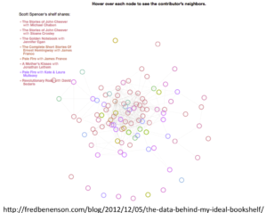
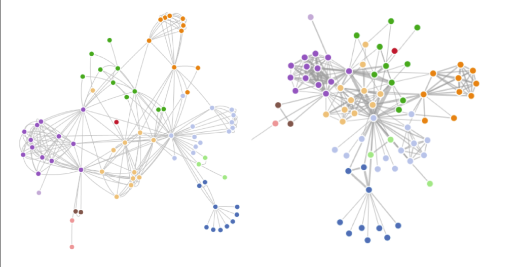
Network visualisation http://fredbenenson.com
When teaching datavis, I give people time to explore examples like this, then ask questions like 'Can you tell what is being measured or described? What do the relationships mean?'. After talking about the pros and cons of network visualisations, discussion often reaches a 'yes, but so what?' moment.
Here are some examples of problems ordinary people have with network visualisations…
Location matters
Spatial layout based on the pragmatic aspects of fitting something on the screen using physics, rules of attraction and repulsion doesn't match what people expect to see. It's really hard for some to let go of the idea that spatial layout has meaning. The idea that location on a page has meaning of some kind is very deeply linked to their sense of what a visualisation is.
Animated physics is … pointless?
People sometimes like the sproinginess when a network visualisation resettles after a node has been dragged, but waiting for the animation to finish can also be slow and irritating. Does it convey meaning? If not, why is it there?
Size, weight, colour = meaning?
The relationship between size, colour, weight isn't always intuitive – people assume meaning where there might be none.
In general, network visualisations are more abstract than people expect a visualisation to be.
'What does this tell me that I couldn't learn as quickly from a sentence, list or table?'
Table of data, via http://fredbenenson.com/
Scroll down the page that contains the network graph above and you get other visualisations. Sometimes they're much more positively received, particularly people feel they learn more from them than from the network visualisation.
Onto other issues with 'network visualisations as communication'…
Which algorithmic choices are significant?
Mike Bostock's force-directed and curved line versions of character co-occurrence in Les Misérables
It's hard for novices to know which algorithmic and data-cleaning choices are significant, and which have a more superficial impact.
Untethered images
Images travel extremely well on social media. When they do so, they often leave information behind and end up floating in space. Who created this, and why? What world view does it represent? What source material underlies it, how was it manipulated to produce the image? Can I trust it?
'Can't see the wood for the trees'
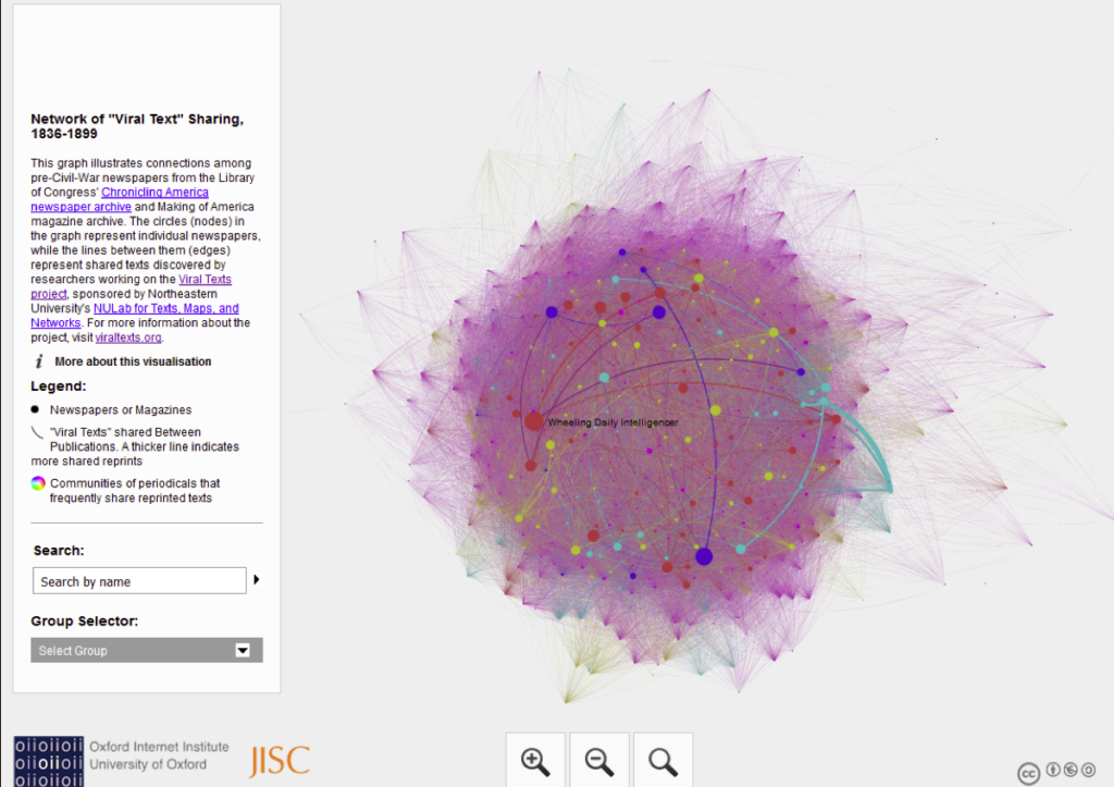
When I showed this to a class recently, one participant was frustrated that they couldn't 'see the wood for the trees'. The visualisations gives a general impression of density, but it's not easy to dive deeper into detail.
Stories vs hairballs
But when I started to explain what was being represented – the ways in which stories were copied from one newspaper to another – they were fascinated. They might have found their way there if they'd read the text but again, the visualisation is so abstract that it didn't hint at what lay underneath. (Also I have only very, very rarely seen someone stop to read the text before playing with a visualisation.)
No sense of change over time
This flattening of time into one simultaneous moment is more vital for historical networks than for literary ones, but even so, you might want to compare relationships between sections of a literary work.
No sense of texture, detail of sources
All network visualisations look similar, whether they're about historical texts or cans of baked beans. Dots and lines mask texture, and don't always hint at the depth of information they represent.
There's a lot to take on to really understand what's being expressed in a network graph.
There is some hope…
Onto the positive bit!
Interactivity is engaging
People find the interactive movement, the ability to zoom and highlight links engaging, even if they have no idea what's being expressed. In class, people started to come up with questions about the data as I told them more about what was represented. That moment of curiosity is an opportunity if they can dive in and start to explore what's going on, what do the relationships mean?
…but different users have different interaction needs
For some, there's that frustration expressed earlier they 'can't get to see a particular tree' in the dense woods of a network visualisation. People often want to get to the detail of an instance of a relationship – the lines of text, images of the original document – from a graph.
This mightn't be how network visualisations are used in research, but it's something to consider for public-facing visualisations. How can we connect abstract lines or dots to detail, or provide more information about what the relationship means, show the quantification expressed as people highlight or filter parts of a graph? A harder, but more interesting task is hinting at the texture or detail of those relationships.
Proceed, with caution
One of the workshop questions was 'Are social network analysis theories and methods relevant for public-facing applications?' – and maybe the answer is a qualified yes. As a working tool, they're great for generating hypotheses, but they need a lot more care before exposing them to the public.
[As an aside, I’d always taken the difference between visualisations as working tools for exploring data – part of the process of investigating a research question – and visualisation as an output – a product of the process, designed for explanation rather than exploration – as fundamental, but maybe we need to make that distinction more explicit.]
But first – who are your 'users'?
During this workshop, at different points we may be talking about different 'users' – it's useful to scope who we mean at any given point. In this presentation, I was talking about end users who encounter visualisations, not scholars who may be organising and visualising networks for analysis.
Sometimes a network visualisationisn't the answer … even if it was part of the question.
As an outcome of an exploratory process, network visualisations are not necessarily the best way to present the final product. Be disciplined – make yourself justify the choice to use network visualisations.
No more untethered images
Include an extended caption – data source, tools and algorithms used. Provide a link to find out more – why this data, this form? What was interesting but not easily visualised? Let people download the dataset to explore themselves?
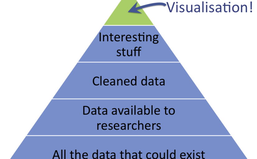
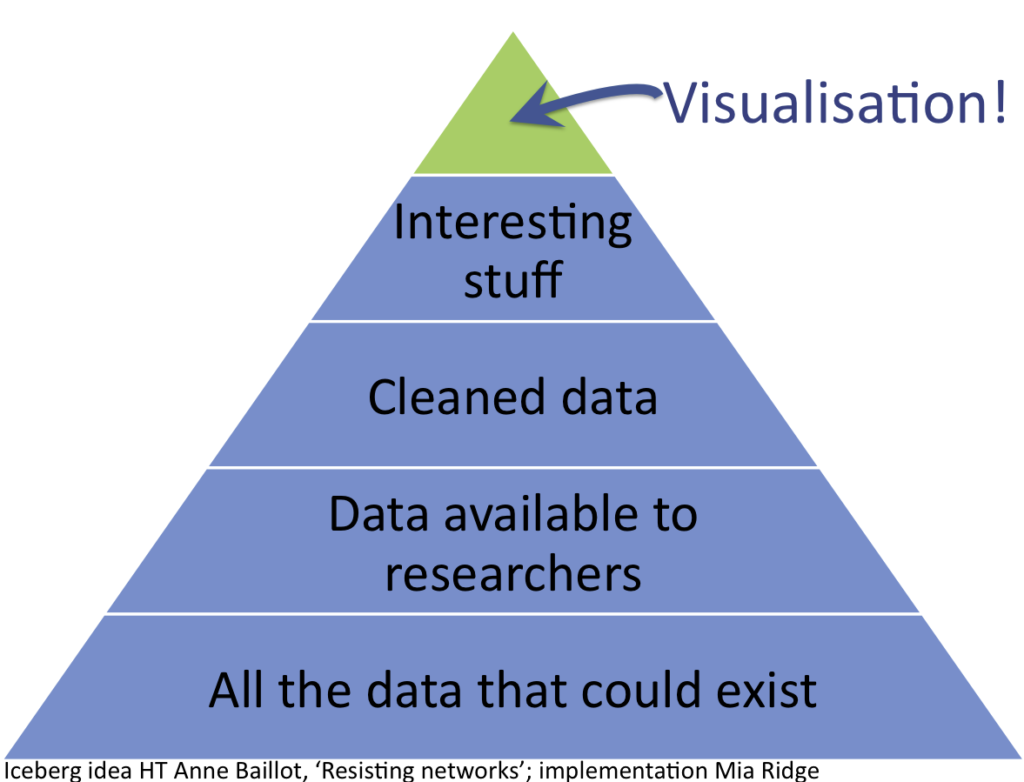
Present visualisations as the tip of the data iceberg
Visualisations are the tip of the iceberg
Lots of interesting data doesn't make it into a visualisation. Talking about what isn't included and why it was left out is important context.
Talk about data that couldn't exist
Beyond the (fuzzy, incomplete, messy) data that's left out because it's hard to visualise, data that never existed in the first place is also important:
'because we're only looking on one axis (letters), we get an inflated sense of the importance of spatial distance in early modern intellectual networks. Best friends never wrote to each other; they lived in the same city and drank in the same pubs; they could just meet on a sunny afternoon if they had anything important to say. Distant letters were important, but our networks obscure the equally important local scholarly communities.' Scott Weingart, 'Networks Demystified 8: When Networks are Inappropriate'
Help users learn the skills and knowledge they need to interpret network visualisations in context.
How? Good question! This is the point at which I hand over to you…
I came across Joshua Sternfeld's definition of 'digital historiography' while I was writing my thesis, and two parts of it very neatly described what I was up to – firstly, the 'interdisciplinary study of the interaction of digital technology with historical practice' – and secondly, seeking to understand the 'construction, use, and evaluation of digital historical representations'.[1]However, the size and shape of the gap between digital historiography and 'digital history' is where I tend to get stuck. I've got a draft post on the various types of 'digital history' that's never quite ready to go live.* Is digital history like art history – a field with its own theoretical concerns and objects of study – or will it eventually merge into 'history' as everyone starts integrating digital methods/tools and digitised sources into their work, in the same way that social or economic history have influenced other fields?
The real reason for me for talking about the digital humanities is that we need to realize the humanities never were the humanities. They are the print humanities and they are conditioned by print. So the question the term “digital humanities” poses is: How must humanities disciplines change if we are no longer working in a print world? This question, to me, is crucial. It is an intellectual question. And the question being proposed is: What happens to the humanities when digital methodologies are applied to them or when they start to interrogate digital methodologies? Both of these questions are crucial and that is what this term — “digital humanities” — keeps front and center.
* Partly because 'digital history' changes at a fairly constant rate and my thoughts shift correspondingly.
[1] Joshua Sternfeld, ‘Archival Theory and Digital Historiography: Selection, Search, and Metadata as Archival Processes for Assessing Historical Contextualization’, American Archivist 74, no. 2 (2011): 544–75, http://archivists.metapress.com/index/644851P6GMG432H0.pdf.
Another quick post with news on crowdsourcing in cultural heritage, citizen science and citizen history in April(ish) 2016…
Acceptances for our DH2016 Expert Workshop: Beyond The Basics: What Next For Crowdsourcing? have been sent out. If you missed the boat, don't panic! We're taking a few more applications on a rolling basis to allow for people with late travel approval for the DH2016 conference in July.
Probably the biggest news is the launch of citizenscience.gov, as it signals the importance of citizen science and crowdsourcing to the US government.
From the press release: 'the White House announced that the U.S. General Services Administration (GSA) has partnered with the Woodrow Wilson International Center for Scholars (WWICS), a Trust instrumentality of the U.S. Government, to launch CitizenScience.gov as the new hub for citizen science and crowdsourcing initiatives in the public sector.
CitizenScience.gov provides information, resources, and tools for government personnel and citizens actively engaged in or looking to participate in citizen science and crowdsourcing projects. … Citizen science and crowdsourcing are powerful approaches that engage the public and provide multiple benefits to the Federal government, volunteer participants, and society as a whole.'
There's also work to 'standardize data and metadata related to citizen science, allowing for greater information exchange and collaboration both within individual projects and across different projects'.
Other news:
Responses to questions about if the volunteers agreed that the Zooniverse… From Science Learning via Participation in Online Citizen Science


