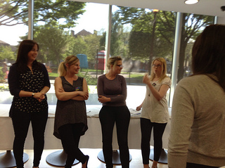
Back in November I attended the Museum Computer Network (MCN2011) conference for the first time. I was lucky enough to get a scholarship (for which many, many thanks). During the conference I was part of a panel discussing 'What's the point of a museum website?' with (from l-r in the photo) Koven Smith (@5easypieces), Eric Johnson (@ericdmj), Nate Solas (@homebrewer) and Suse Cairns (@shineslike). I've posted about some of the ideas covered in the WPMW session, but this post is my attempt to think through 'what is the point of a museum website?' in the context of our MCN session. I'm not lying when I say 'attempt' – this post is a draft, but since it's been a draft for months now, I'm going to take a deep breath and post it. I'd love to hear your thoughts, challenges, props, whatever, and I'll update the post in response.
I've started thinking of museum websites as broadly fitting into three categories:
1. The practicalities. Unashamed brochureware may be enough for some museums (and may be all other museums, such as local authority museums tied to larger infrastructure, can manage): the practical, get-people-through-the-door stuff: why visit, how to get there, when to visit, what's on. Facebook and Google are competing to host content like this, so presumably visits to these sites are generally going to decrease over time. This category reflects economic and organisational restrictions more than user requirements.
2. Collections online. An important, opinionated caveat: unless your 'collections online' interface is a destination in its own right, or adds unique value, I think the point lies in aggregated collections. Repositories like Europeana (and national aggregators like CultureGrid and Gallica), Collections Australia Network, Digital NZ, and the future Digital Public Library of America bring heavy-weight resources, SEO and discoverability and sheer scale to the 'collections online' work of a museum website. But this scale brings new problems – these big, chaotic pots of content can be difficult to use. Their sheer size makes it hard to highlight interesting objects or content. Meaningful search results are difficult*, even for the patient, expert researcher, because they tend to contain so many different kinds of content about a range of subjects, taken from a variety of source museums, libraries, archives with hugely variable metadata quality and schema. Better search engines, faceted browsing, etc, may help, but aggregators aren't really designed for humans**. See also: 3a, 'The carefully curated and designed experience based on a particular concept' for a different view on collections online.
3. The messy middle. This includes all kinds of things that general audiences don't seem to expect on a museum website – exhibition and marketing microsites, educational and family activities, public engagement experiences, games, lists of objects on display, research activities, etc. It's a pretty safe guess that some of this content is online because it reflects the internal structure or requirements of the museum, is re-purposed from exhibitions, or is designed for specialist users (who may, however, also under-use it unless the collection is notably comprehensive or is one of the top hits for a Google search). For museums, the point of a museum website may be editorial voice, control, metrics, or an attempt to monetise their images.
We know that lots of the messy middle really works for our audiences – for example, good games and other activities have metrics through the roof. But without more research it's hard to know whether the content that audiences should love is less used than it might be because it's not easily discoverable by non-visitors to the website, isn't well advertised or consistently available on museum sites, or is competing with other groups that meet the same needs. Does the trust people place in museums translate into trusted online content – how much do audiences really know or care whether an online experience, mobile app or the answer to their kid's homework question was provided by a museum? Do they value 'authority' as much as we do? When does museum content go from being 'on your website' to 'being on the web', and does it still matter?
For one potential point for museum websites, I need to refer back to the collection aggregators. In an ideal world, the availability of images, reusable data licenses, organisational processes, and machine-readable data that populate these mega-collections would make it easy to create more tightly-defined cross-collection experiences based on carefully chosen sub-sets of aggregated collections. In other words…
3a. The carefully curated and designed experience based on a particular concept. From the Google Art Project to Europeana's Weddings In Eastern Europe, sites that draw on digital objects and expert knowledge to create audience-focused experiences could be the missing link between the in-gallery exhibitions museums love and the audience-focused born-digital experiences that are appropriately rich and/or snackable, and could be the source of the next great leap forward in museums on the web. Museums can take the lessons learnt from years of topic-specific cross-institutional projects and research on existing audiences, and explore new models for audience engagement with museums online. And perhaps more importantly, work out how to fit that into places our audiences already hang out online and let them share it promiscuously.
So, what's the point of a museum website? At the simplest level, the point of a museum website is to get visitors into venues, and maybe to sell them tickets or products. Ideally, the point of aggregators is to surface content hidden in the deep web so it's discoverable on your Google search results page and can be put into context with other resources. The very messiness of messy middle category makes it harder to answer the question – it's the fun stuff, but most of it is also hardest to measure or to justify in terms of return on investment.
This is where asking more specific questions becomes more useful: not just, 'what's the point?' but 'the point for whom?'. In the cold light of the budget cuts, perhaps it's better to ask 'how do you prioritise your museums' web work?'. Both the 'practicalities' and the aggregators are broadly about access – getting people into the galleries or to catalogue records so they can discover and make the most of your collections. The messy middle bit is broadly about engagement, which I suspect is key to broadening access by providing better ways for more people to access our collections.
As a museum technologist it hurts to say this, but if your museum isn't genuinely interested in online engagement or just can't resource it, then maybe the point of your website is to meet the practicalities as well as you can and push your content up into an aggregator. I think we're still working to understand the role of online content in the relationship between museums and their audiences, but despite my final note of doom and gloom, I hope museums keep working at it. As Bruce Wyman tweeted at the MCN session, "current visitors most frequently give *incremental* ideas. You need different folk to take those great leaps forward. That's us".
Do we lose more than we gain by separating 'museum as venue' from 'museum as holder of collections' and 'museum as space for engaging with culture, science and history'? And is it acceptable for some museums to stick to brochureware if they can't manage more? What do you think?
—
* The aggregation model also potentially applies to museum shops and picture libraries (ArtFinder, Culture Label, etc) but, perhaps because commercial profits are riding on the quality of the user experience, they tend to have more carefully tended information architecture and they're closer to the 'curated experience'.
** I've also written about audience issues with aggregation (boo) and the potential for 'Museum data and the network effect' (yay!) in 'Museums meet the 21st century', The rise of the non-museum (and death by aggregation), Rockets, Lockets and Sprockets – towards audience models about collections? and (back in 2009) Happy developers + happy museums = happy punters. One reason aggregated collections aren't a great user experience is that paucity of museum collection data, though that can be improved with crowdsourcing, which as a bonus appears to be a great way to engage audiences.
[Update: there's a post on the Huffington Post (I know, but what can you do?) on 'What Makes for Compelling Museum Websites? When to Break the Rules' that posits 'Viewer Focused', 'Mirror' and 'Augmented' design principles for exhibition microsites. This model seems to be about how strictly the microsite matches the objects in the exhibition, and whether the visitor can comment or use a variety of methods for navigating through the content.]
