Museum Computer Network 2011 conference notes

Last November I went to the Museum Computer Network (MCN2011) conference for the first time – I was lucky enough to get a scholarship (for which many, many thanks).  The theme was 'hacking the museum: innovation, agility and collaboration' and the conference was packed with interesting sessions.My rough notes are below, though they're probably even sketchier than usual because I had a pretty full conference (running a workshop, taking part in a panel and a debate).  (I thought I'd posted this at the time, but I just found it in draft, so here goes…)

Pre-conference workshop, Wednesday
I ran a half-day workshop on 'Hacking and mash-ups for beginners', which had a great turn-out of people willing to get stuck in.  The basic idea was to give people a first go at scripting 'hello world' and a bit beyond (with JavaScript, because it can be run locally), to provide some insight into thinking computationally (understanding something of programmers think and how ideas might be turned into something on a screen), to play with real museum data and try different visualisation tools to create simple mashups.  My slides and speaker notes are at Hacking and mash-ups for beginners at MCN2011 and I'd be happy to share the exercises on request.  I used lots of cooking/food analogies so have a snack to hand in case the slides make you hungry! I had lots of good feedback from the workshop, but I think my favourite comment was this from Katie Burns (@K8burns): '…I loved the workshop. I nerded out and kept playing with your exercises on my flight home from ATL.'.

Thursday
Kevin Slavin's (@slavin_fpo) thought-provoking keynote took us to Walter Benjamin by way of the Lascaux Caves and onto questions like: what does it do to us [as writers of wall captions and object labels] when objects provide information?.  He observed, 'visitors turn to the caption as if the work of art is a question to be answered' – are we reducing the work to information?  We should be evoking, rather than educating; amplifying rather than answering the question; producing a memory instead of preserving one; making the moment in which you're actually present more precious… Ultimately, the authenticity of his experience [with the artwork in the caves] was in learning how to see it [in the context, the light in which it was created]. Kevin concluded that technology is not about giving additional things to look at, but additional ways to see.

I've posted about the panel discussing 'What's the point of a museum website?' I was in after the keynote at Report from 'What's the point of a museum website'… and Brochureware, aggregators and the messy middle: what's the point of a museum website?.  I also popped into the session 'Valuing Online-only Visitors: Let's Get Serious' which was grappling with many of the issues raised by Culture 24's action research project, How to evaluate success online?.  This all seems to point to a growing momentum for finding new measurable models for value and engagement, possibly including online to on-site conversion, impact, even epiphanies. Interestingly, crowdsourcing is one place where it's relatively easy to place a monetary value on online action – @alastairdunning popped up to say: 'http://www.oucs.ox.ac.uk/ww1lit/ project – 'Normal' digitisation = £40 per item. Crowdsourced = £3.50 per item', adding 'But obviously cultural value of a Wilfred Owen mss is more than your neighbour's WW1 letters and diaries'.

Friday
One of the sessions I was most looking forward to was Online cataloguing tools and strategies, as it covered crowdsourcing, digital scholarly practices and online collections – some of my favourite things!

Digital Mellini turned 17th C Italian manuscript (an inventory of paintings written in rhyming verse) into an online publication and a collaboration tool for scholars. The project asked 'What will digital art history look like?'.  The old way of doing art history was about solo exploration, verbal idea-sharing, physical book publications, unlinked data, image rights issues; but the promise of digital scholarship is: linked data opens new routes to analysis, scholars collaborate online, conversations are captured, digital-only publications count for tenure, no copyright restrictions… I was impressed by their team-based, born-digital approach, even if it's not their norm: 'the process was very non-Getty, it was iterative and agile'.  They had a solid set of requirements included annotations and conversations at the word or letter level of the text, with references to related artworks. They're now tackling 'rules of engagement' for scholars – where to comment, etc – and working out what an online publication looks like and how it affects scholarly practices.

Yale Center for British Art (YCBA) Online Collections's goal was search across all YCBA collections.  All the work they've done is open source – Solr, Lucene – cool!  They're also using LIDO (superceding CDWA and MuseumDat) and looking to linked data including vocabulary harmonisation.  As with many cross-catalogue projects, they ended up using a lowest common denominator between collections and had to compromise on shared fields in search.  I'm not sure who used the lovely phrase 'dedication to public domain'… Both art history presentations mentioned linked data – we've come far!

The final paper was Crowdsourcing transcription: who, why, what and how, with Perian Sully from Balbao Park talking with Ben Brumfield about how they've used his 'From the Page' transcription software.  Transcription is not only useful because you can't do OCR on cursive writing, but it's also a form of engagement and outreach (as I've found with other cultural heritage crowdsourcing).  They covered some similar initiatives like Family Search Indexing, whose goal is to get 175,000 new user volunteering to transcribe records (they've already transcribed close to a billion records) and the Historic Journals project whose goal is to link transcriptions with records in genealogy databases (and lots more examples but these were most relevant to my PhD research).

Reasons for crowd participation (from an ornithology project survey) included the importance of the programme, filling free time, love of nature, civic duty and school requirement.  People participate for a sense of purpose, love of the subject, immersion in the text (deep reading). The question of fun leads into peril of gamification – if you split text line by line to make a microtask-style game, you lose the interesting context.

They gave some tips on how to start a crowdsourced transcription project based on your material and the uses for your transcription.  The design will also affect interpretive decisions made when transcribing – do you try to replicate the line structure on the page? – and can provide incentives like competition to transcribe more materials, though as Perian pointed out, accuracy can be affected by motivation.

I had to leave Philosophical Leadership Needed for the Future: Digital Humanities Scholars in Museums early but it all made a lot more sense to me when I realised Neal wasn't using 'digital humanities' in the sense it's used academically (the application of computational techniques to humanities research questions) – as I see it, he's talking about something much closer to 'digital heritage'.

I still haven't sorted out my notes from History Museums are not Art Museums: Discuss! but it was one of my favourite sessions and a great chance to discuss one of my museumy interests with really smart people.

Saturday
I popped into a bit of THATCamp/CultureHack and had fun playing with an imaginary museum, but unfortunately I didn't get to spend any time in the THATCamp itself, because…

The MCN 'Great Debate'
I was invited to take part in the Great Debate held as the closing plenary session.  I was on the affirmative side with Bruce Wyman, debating 'there are too many museums' against Rob Stein and Roseanna Flouty. For now, I think I'll just say that I think it's the hardest bit of public speaking I've ever done – the trickiness of the question was the least of it!  I think there's a tension between the requirements of the formal debating structure and the desire to dissect the question so you can touch on issues relevant to the audience, so it'll be interesting to see how the format might change in future.

Finally, a silly tweet from me: '#mcn2011 I've decided the perfect visitor-friendly museum is the Mona Lisa on spaceship held by a dinosaur. That you can buy on a t-shirt.' lead to the best thing ever from @timsven: '@mia_out- this pic is for you- museum of the future: trex w/ mona lisa riding millenium falcon #MCN2011 http://t.co/37GdAD1O'.
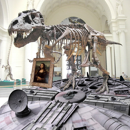
Museum of the Future

Report from 'What's the point of a museum website' at MCN2011

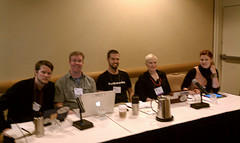
A really belated report from the 'What's the point of a museum website?' panel I was part of with Koven Smith (@5easypieces), Eric Johnson (@ericdmj), Nate Solas (@homebrewer) and Suse Cairns (@shineslike) at last November's Museum Computer Network (MCN2011) conference.  I've written up some of my own thoughts at Brochureware, aggregators and the messy middle: what's the point of a museum website? – this post is about the discussion during the panel itself.  There was a lot of audience participation (in the room and on twitter), which made tackling a summary of the discussion really daunting, so I've given up on trying to capture every thread of conversation and am just reporting from the notes I took at the time.

It's all bit of a blur now so it's hard to remember exactly how the conversations went, but from my notes at the time, it included: Clay Shirky on social objects as a platform for conversation; games and other online experiences as big draws for museum sites (trusted content is a boon for parents); the impact of social media making the conversations people have always had about exhibitions and objects visible to curators and others; and the charisma of the physical object. From the audience Robin White Owen mentioned the potential for mobile apps to create space, opportunity for absorption and intimate experiences with museum content, leading me to wonder if you can have a Stendhal moment online?

Is discoverability is the new authority for museum websites?  As Nate said, authority online lies in being active online, though we also need to differentiate between authority about objects and narratives, and cite our sources for statements about online collections.  (See also Rob Stein on the difference between being authoritarian and authoritative). But maybe that's challenging too – perhaps museums aren't good at saying there is no right answer because we like to be the one with the right answer. Someone mentioned 'communities of passion' gathered around specific objects, which is a lovely phrase and I'm sorry I can't remember who said it.  Someone else from the audience wisely said, it's 'not how do I drive people to my collection, but how do I drive my collection to them'.  Andrew Lewis talked about 'that inspiration moment' triggered in a museum that sends you hurrying back home to make art or craft something.

I talked about my dream of building a site that people would lose themselves in for hours, just as you can do on Wikipedia now after starting with one small query.  How can we build a collections online site where people can follow one interesting-looking object or story after another?  We can't do that without a critical mass of content, and I suspect this can only be created by bringing different museum collections together digitally (or as Koven called it, digital repatriation), which also gets around the random accidents of collecting history that mean related objects are isolated in museums and galleries around the world.  Also, we're only ever part of the audience's session online – we might be the start, or the end, but we're more likely to be somewhere in the middle. We should be good team players and use our expert knowledge to help people find the best information they can.

Looking back, a lot of the conversation appears to be about how to create the type of rich experience of being in the presence of an object – a moment in time as well as in space – from the currently flat experience of looking at an object in an online catalogue (particularly when the online environment has all the distractions of kitten videos and social media notifications).  Can storytelling or bite-sized bits of content about objects act as 'hooks' to enable reflection and learning online?  Hugh Wallace has used the phrase 'snackable content' for readily available content that fits into how people use technology, and I think (with my conversational, social history bias) that stories-as-anecdotes can be a great way of sharing information about collections while creating that self-contained moment in time.  (And yes, I am side-stepping Walter Benjamin's statement that 'that which withers in the age of mechanical reproduction is the aura of the work of art'. Not that he was in the room, but he does tend to haunt these conversations.)

As with many conversations about online visitors, the gap between what we know and what we should know is frustratingly large, and we still don't know how large the gap between what (particularly) collections online are and what they could be.  Someone said that we're (measuring, or talking about) what users currently do with what we give them, not what they really want to do.  Bruce Wyman tweeted, 'current visitors most frequently give *incremental* ideas. You need different folk to take those great leaps forward. That's us'. Rob Stein said he didn't care about measuring time online, but wanted to be able to measure epiphanies – an excellently provocative statement that generated lots of discussion, including comments that epiphany needs agency, discourse, and serendipity. Eric said we murder epiphany by providing too much information, but others pointed out that epiphanies are closely tied to learning, so maybe it's a matter of the right information at the right time for the right person and a good dose of luck.

So (IMO) it was a great panel session, but did we come up with an answer for 'what's the point of a museum website'?  Probably not, but it's clearly a discussion worth having, and I dare say there were a few personal epiphanies during the session.

I'm collecting other posts about the session and will update this as I find them (or let me know of them in the comments): Suse's Initial takeaways from MCN2011.  I also collated some of the tweets that used the session hashtag 'wpmw' in a document available (for now) via my dropbox.

Finally, thank you to everyone who attended or followed via twitter, and particular thanks to my fellow panelists for a great discussion.

Brochureware, aggregators and the messy middle: what's the point of a museum website?

MCN 2011, Hyatt Regency Atlanta, What's The Point of a Museum Website, November 17th
Photo: nealstimler

Back in November I attended the Museum Computer Network (MCN2011) conference for the first time.  I was lucky enough to get a scholarship (for which many, many thanks).  During the conference I was part of a panel discussing 'What's the point of a museum website?' with (from l-r in the photo) Koven Smith (@5easypieces), Eric Johnson (@ericdmj), Nate Solas (@homebrewer) and Suse Cairns (@shineslike).  I've posted about some of the ideas covered in the WPMW session, but this post is my attempt to think through 'what is the point of a museum website?' in the context of our MCN session.  I'm not lying when I say 'attempt' – this post is a draft, but since it's been a draft for months now, I'm going to take a deep breath and post it.  I'd love to hear your thoughts, challenges, props, whatever, and I'll update the post in response.

I've started thinking of museum websites as broadly fitting into three categories:

1. The practicalities. Unashamed brochureware may be enough for some museums (and may be all other museums, such as local authority museums tied to larger infrastructure, can manage): the practical, get-people-through-the-door stuff: why visit, how to get there, when to visit, what's on. Facebook and Google are competing to host content like this, so presumably visits to these sites are generally going to decrease over time.  This category reflects economic and organisational restrictions more than user requirements.

2. Collections online.  An important, opinionated caveat: unless your 'collections online' interface is a destination in its own right, or adds unique value, I think the point lies in aggregated collections.  Repositories like Europeana (and national aggregators like CultureGrid and Gallica), Collections Australia Network, Digital NZ, and the future Digital Public Library of America bring heavy-weight resources, SEO and discoverability and sheer scale to the 'collections online' work of a museum website.  But this scale brings new problems – these big, chaotic pots of content can be difficult to use.  Their sheer size makes it hard to highlight interesting objects or content.  Meaningful search results are difficult*, even for the patient, expert researcher, because they tend to contain so many different kinds of content about a range of subjects, taken from a variety of source museums, libraries, archives with hugely variable metadata quality and schema.  Better search engines, faceted browsing, etc, may help, but aggregators aren't really designed for humans**.  See also: 3a, 'The carefully curated and designed experience based on a particular concept' for a different view on collections online.

3. The messy middle.  This includes all kinds of things that general audiences don't seem to expect on a museum website – exhibition and marketing microsites, educational and family activities, public engagement experiences, games, lists of objects on display, research activities, etc.  It's a pretty safe guess that some of this content is online because it reflects the internal structure or requirements of the museum, is re-purposed from exhibitions, or is designed for specialist users (who may, however, also under-use it unless the collection is notably comprehensive or is one of the top hits for a Google search).  For museums, the point of a museum website may be editorial voice, control, metrics, or an attempt to monetise their images.

We know that lots of the messy middle really works for our audiences – for example, good games and other activities have metrics through the roof.  But without more research it's hard to know whether the content that audiences should love is less used than it might be because it's not easily discoverable by non-visitors to the website, isn't well advertised or consistently available on museum sites, or is competing with other groups that meet the same needs.  Does the trust people place in museums translate into trusted online content – how much do audiences really know or care whether an online experience, mobile app or the answer to their kid's homework question was provided by a museum?  Do they value 'authority' as much as we do?  When does museum content go from being 'on your website' to 'being on the web', and does it still matter?

For one potential point for museum websites, I need to refer back to the collection aggregators.  In an ideal world, the availability of images, reusable data licenses, organisational processes, and machine-readable data that populate these mega-collections would make it easy to create more tightly-defined cross-collection experiences based on carefully chosen sub-sets of aggregated collections.  In other words…

3a. The carefully curated and designed experience based on a particular concept.  From the Google Art Project to Europeana's Weddings In Eastern Europe, sites that draw on digital objects and expert knowledge to create audience-focused experiences could be the missing link between the in-gallery exhibitions museums love and the audience-focused born-digital experiences that are appropriately rich and/or snackable, and could be the source of the next great leap forward in museums on the web.  Museums can take the lessons learnt from years of topic-specific cross-institutional projects and research on existing audiences, and explore new models for audience engagement with museums online.  And perhaps more importantly, work out how to fit that into places our audiences already hang out online and let them share it promiscuously.

So, what's the point of a museum website?  At the simplest level, the point of a museum website is to get visitors into venues, and maybe to sell them tickets or products.  Ideally, the point of aggregators is to surface content hidden in the deep web so it's discoverable on your Google search results page and can be put into context with other resources.  The very messiness of messy middle category makes it harder to answer the question – it's the fun stuff, but most of it is also hardest to measure or to justify in terms of return on investment.

This is where asking more specific questions becomes more useful: not just, 'what's the point?' but 'the point for whom?'.  In the cold light of the budget cuts, perhaps it's better to ask 'how do you prioritise your museums' web work?'.  Both the 'practicalities' and the aggregators are broadly about access – getting people into the galleries or to catalogue records so they can discover and make the most of your collections.  The messy middle bit is broadly about engagement, which I suspect is key to broadening access by providing better ways for more people to access our collections.

As a museum technologist it hurts to say this, but if your museum isn't genuinely interested in online engagement or just can't resource it, then maybe the point of your website is to meet the practicalities as well as you can and push your content up into an aggregator.  I think we're still working to understand the role of online content in the relationship between museums and their audiences, but despite my final note of doom and gloom, I hope museums keep working at it.  As Bruce Wyman tweeted at the MCN session, "current visitors most frequently give *incremental* ideas. You need different folk to take those great leaps forward. That's us". 

Do we lose more than we gain by separating 'museum as venue' from 'museum as holder of collections' and 'museum as space for engaging with culture, science and history'?  And is it acceptable for some museums to stick to brochureware if they can't manage more?  What do you think?  


* The aggregation model also potentially applies to museum shops and picture libraries (ArtFinder, Culture Label, etc) but, perhaps because commercial profits are riding on the quality of the user experience, they tend to have more carefully tended information architecture and they're closer to the 'curated experience'.

** I've also written about audience issues with aggregation (boo) and the potential for 'Museum data and the network effect' (yay!) in 'Museums meet the 21st century'The rise of the non-museum (and death by aggregation)Rockets, Lockets and Sprockets – towards audience models about collections? and (back in 2009) Happy developers + happy museums = happy punters.  One reason aggregated collections aren't a great user experience is that paucity of museum collection data, though that can be improved with crowdsourcing, which as a bonus appears to be a great way to engage audiences.

[Update: there's a post on the Huffington Post (I know, but what can you do?) on 'What Makes for Compelling Museum Websites? When to Break the Rules' that posits 'Viewer Focused', 'Mirror' and 'Augmented' design principles for exhibition microsites.  This model seems to be about how strictly the microsite matches the objects in the exhibition, and whether the visitor can comment or use a variety of methods for navigating through the content.]